Study Case
Common problem arise during responsive web design CSS(Cassading style sheet) coding is that the DOM element not scaled into correct ratio
for example on current pipenpoof.com (taken at 30 nov, 10 AM jakarta time/GMT+7) following element are failed to scale on different screen size.
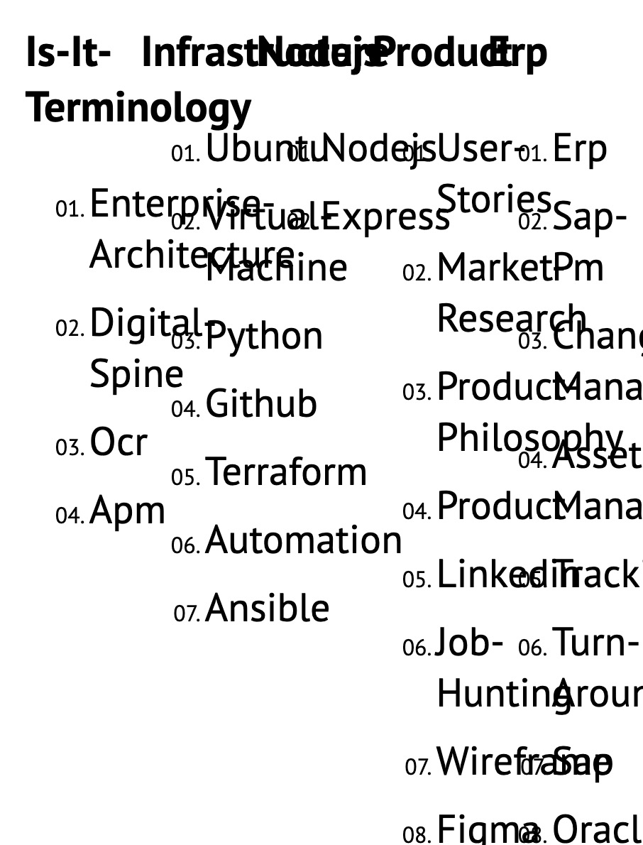
List on Homepage
Last update list which has link inside it failed to scale out during mobile view.
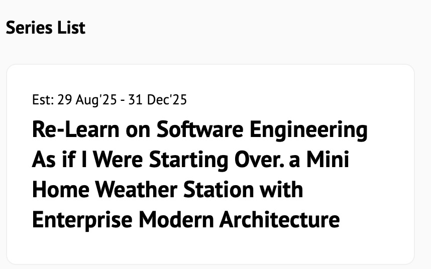
issue#1 homepage - series list
 unscaled list element on the series
issue#1 homepage - last update list
 unscaled list element on the last update
Date on Homepage
series section has a div list, however the date text size is too small if viewed on mobile view.
issues#2 - Series date
 unscaled date text on the series section
Section title on Homepage
“series list” text above is using section-title class and this class is not properly scaled out on mobile view.
issues#3 series text with class section-title
Section title on Post Details
there are several element using section-title class:
- post’s series name
- “deliverables” section name
- “share the article” section
- “about the writer” section
- “leave a comment” section
a lot element with section-title class are not scaled properly on mobile view
issues#4 - section title element on post details page
List of Markdown post
all article visualization on pipenpoof.com are written on markdown. Then, those markdown will be converted into HTML.
ol, li and ul element from markdown list is not scaled out on mobile view.
issues#5 - list element not scaled on the post details
H1, H2 of Mardown Post
Heading is not properly scaled on on the mobile view.
issues#6 - heading element on post details
Button on Post Details
there are two button available on post details, they are:
- share to X (formerly called as twitter)
- share to linked in
both are too small if viewed on mobile view.
issues#7 - share button on post details
note: including the text below the share button.
Writer name and category on related post
both of writer name and post category on related post section (after the post markdown) are not scaled properly on mobile view.
issues#8 - writer name and category
 unscaled writer name text and the related post category text
Pagination on Category and Tags View
pagination menu such as previous, next and the page number display are not scaled out properly.
issues#9 - list element on pagination section at post by category and tags section
Footer - build version
looks too small and not properly scaled out.
issues#10 - footer information is not upscaled properly

Explore Section
catasthropic.. not other word to describe it. all element is jumbled left and right. Not proportional scaled as well.
issues#11 - explore section content
 jumbled text on explore section
as well as the popped up navigation sidebar
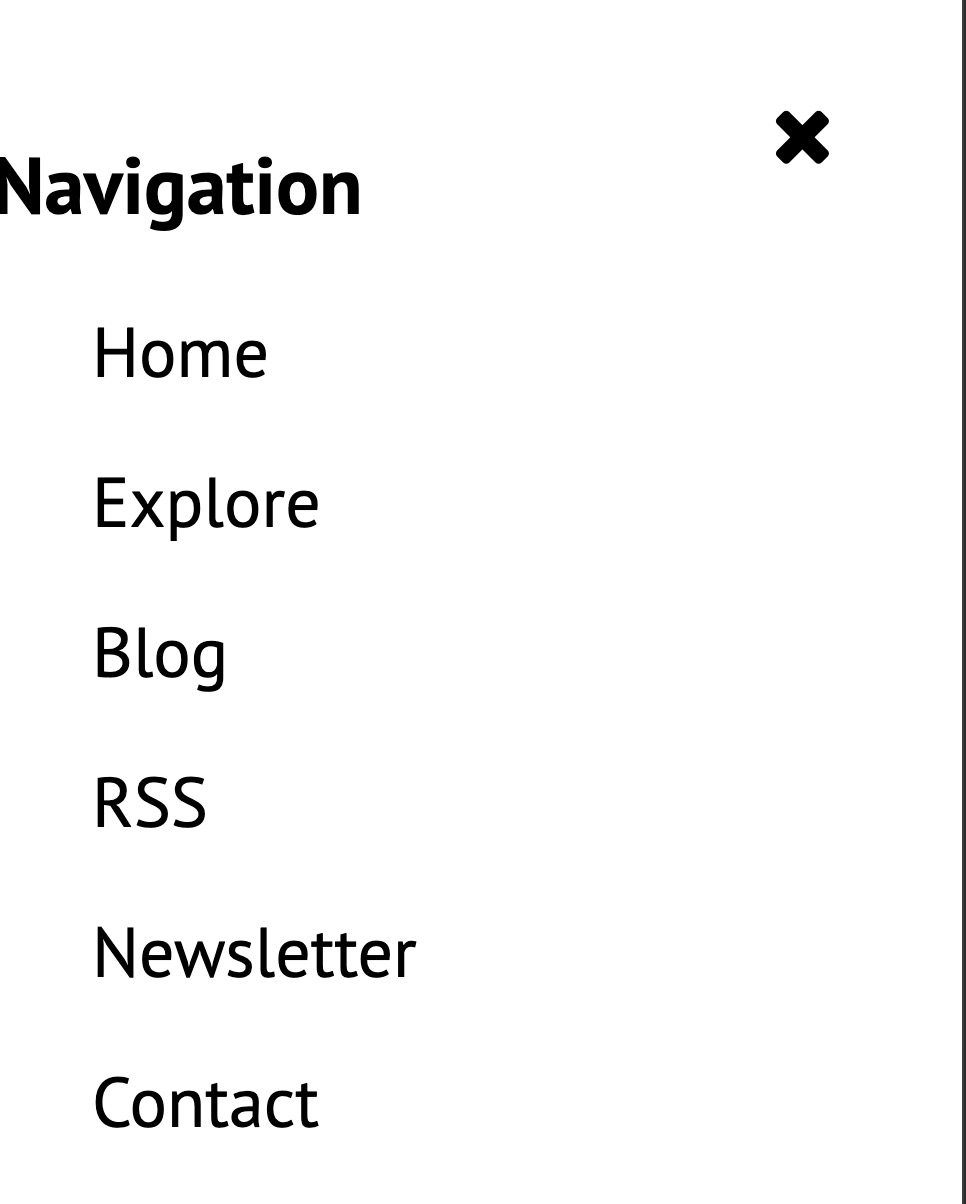 uneven margin on navigation sidebar
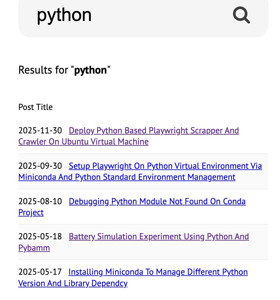
Search result on Search page
listed article is not scaled out properly on mobile view.
issues#12 - unscaled search result
Archive page
not neccesary to be fix as it is seldom to be access by user, but lets include it on the fix to avoid user complaint/bad impression.
issues#13 - archieve page, both 2024 and 2025 (same template)
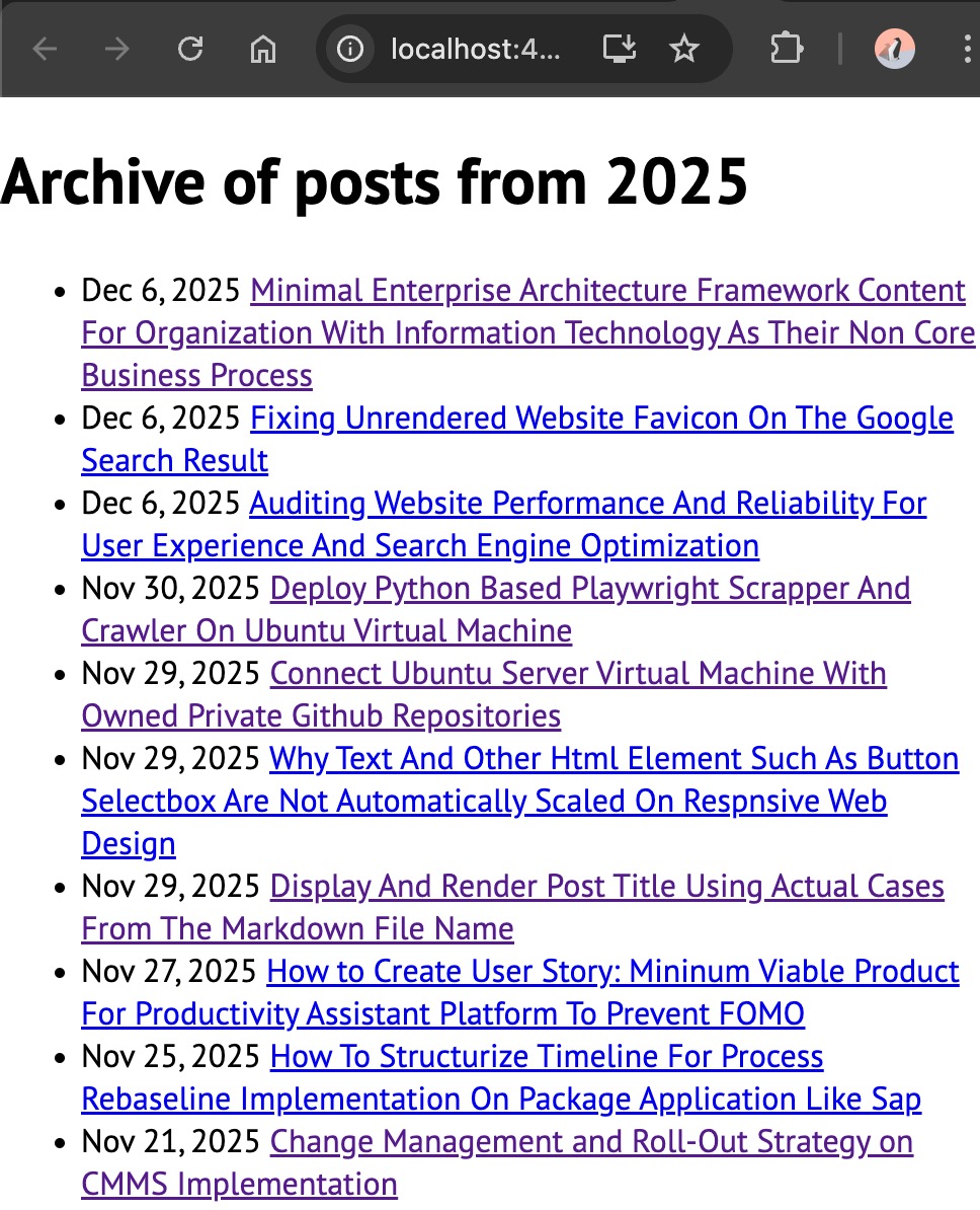 archieved post list not properly scaled out
The Root Causes
all of these issues happened due to single causes
element size is defined using pixel instead of rem!
rem will be scaled out depend on the user screen size where as pixel is not scaleable as each monitor has different pixel depth (absolute unit)
pixel or px also override the user font size settings/configuration.
it is adivseable to use rem or em instead of pixel.
below is the summary of 13 responsive element on each page but unable scale out on different screen size.
| issue# | Page | Affected Element |
|---|---|---|
| 1 | Homepage | Last update list |
| 2 | Homepage | Date Text |
| 3 | Homepage | Section title |
| 4 | Post Details | Section Title |
| 5 | Post Details | List item from the markdown (md) |
| 6 | Post Details | Heading item from the markdown (md) |
| 7 | Post Details | Share button |
| 8 | Related Post | Writer name & Category |
| 9 | Pagination | number and text within pagination at show post by category page and show tags by page |
| 10 | Footer | Build version |
| 11 | Explore | a whole section |
| 12 | Search Result | list article |
| 13 | Archieve | list of archieved article |
The Resolution to Responsive Scaleout
here are the resolution / fixes for each issues
Isses#1 - Homepage Last update list
css fixes (px to rem)
.hl-post-option a, a.gen-links {
  font-size: 1.1rem;
  text-decoration: underline;
  color: #28a745;
  text-transform: capitalize;
}
Isses#2 - Date text on Homepage
css fixes (px to rem)
  .series-new-est {
    font-size: 1.2rem;
  }
Isses#3 - Section title on Homepage
css fixes (px to rem)
  .series-new-est {
    font-size: 1.2rem;
  }
Isses#4 - Section title on Post Details
css fixes (px to rem)
  .series-new-est,
  .new-post-excerpt {
    font-size: 1.4rem;
    line-height: 1.5;
  }

  .theme-divider-word,
  .section-title {
    font-size: 1.5rem;
  }
Isses#5 - List on Post Details Markdown
css fixes (px to rem)
 .post-content ol,
  .post-content ol li {
    margin-left: 0px;
  }

  .post-content ul li,
  .post-content ol li {
    line-height: 2;
    font-size: 1.4rem;
  }
Isses#6 - Heading(h1,h2) on post details
css fixes (px to rem)
  .series-new-est,
  .new-post-excerpt,
  .related-author,
  .profile-shortdesc {
    font-size: 1.4rem;
    line-height: 1.5;
  }
Isses#7 - Share button on post details
css fixes (px to rem)
 .share-btn {
    display: block;
    font-size: 1.4rem;
    margin-bottom: 10px;
    padding-top: 15px;
    padding-bottom: 15px;
  }
Isses#8 - Author name & category on Related Post
css fixes (px to rem)
  .series-new-est,
  .new-post-excerpt,
  .related-author,
  .profile-shortdesc {
    font-size: 1.4rem;
    line-height: 1.5;
  }
Isses#9 - Pagination
css fixes (px to rem)
  .series-new-est,
  .new-post-excerpt,
  .related-author,
  .profile-shortdesc,
  .summary-content,
  .post-feedback,
  .pagination {
    font-size: 1.4rem;
    line-height: 1.5;
  }
Isses#10 - Footer
css fixes (px to rem)
  .series-new-est,
  .new-post-excerpt,
  .related-author,
  .profile-shortdesc,
  .summary-content,
  .post-feedback,
  .pagination, .foot-stats {
    font-size: 1.4rem;
    line-height: 1.5;
  }
Isses#11 - Explore
css fixes (px to rem)
  .site-category-box {
    width: 100%;
    display: block;
  }
Isses#12 - Search Result list
css fixes (px to rem)
  .post-link {
    font-size: 1.4rem;
    line-height: 1.5;
  }
Isses#13 - Archieve
css fixes (px to rem)
  .post-type1-title>.post-date,
  .post-date {
    display: block;
    font-size: 1.4rem;
  }
